AIPAC LOGO Refresh
AIPAC is one of the most powerful lobbying groups in the nation. Politics aside, they have a great creative and marketing team that I’ve worked with extensively, usually on their yearly conference. AIPAC was in the market to visually bring together many of their sub-brands that had been created with no formal guidelines and many times by non-designers. They asked me to come up with a visual identity system to fix the problem. After our first meeting it became apparent they need much more. Their primary logo suffered so I set out to refresh it.
ROLE: Art Director, Designer, Project Manager
TEAM: Anna Gennova, designer

The Problem
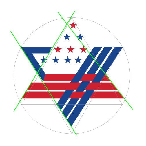
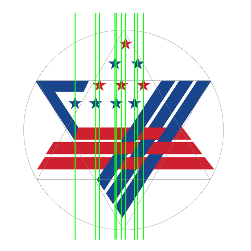
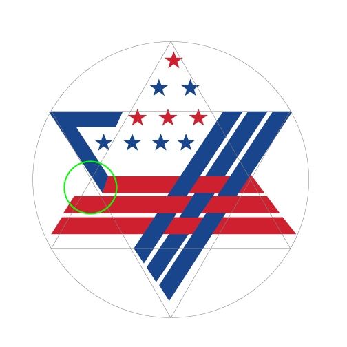
As it sometimes goes with organizations that grow rapidly, no one had ever officially created a logo. AIPACs logo had been created by the wife of an employee solely for use as art for the cover of a report. It was repeatedly used, then used for a different purpose, and eventually it was the official logo. There are a lot of good concepts in the logo but not the refinement that such a large and powerful organization deserves. It lacks symmetry, alignment, and scalability.


The Challenges
Over the course of several discussions with AIPAC we set out some criteria that would make this project successful. AIPAC is an established brand, we wanted to stay in the comfort zone of the members of the AIPAC community.
The new logo would need to resemble the old logo.
The new logo would have to scale and be responsive enough to work on the myriad of media that it would get applied.
The new logo would need to be timeless.
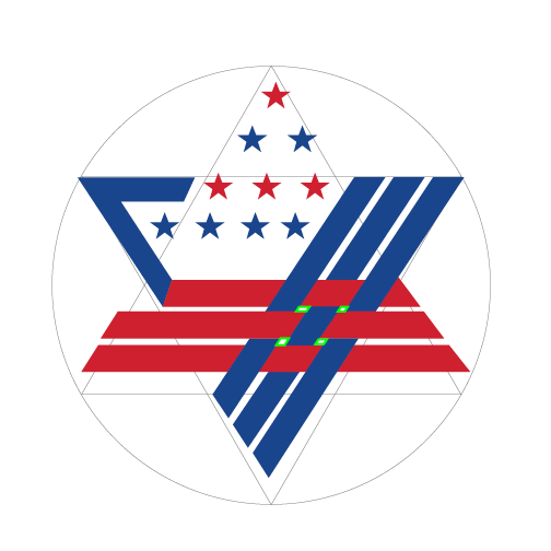
Essentially, we strived to keep the essence of the logo. The star shape, a cluster of stars, and the weaving of stripes we deemed as the elements that drove the story of the logo most.

The Process
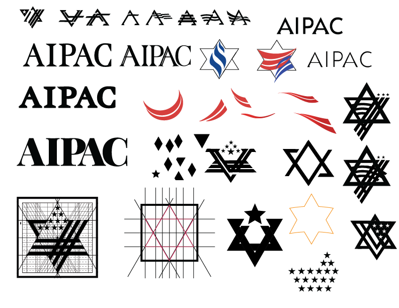
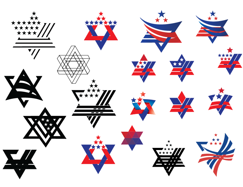
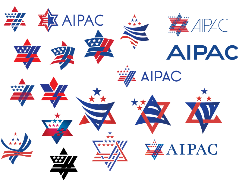
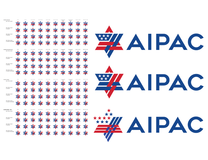
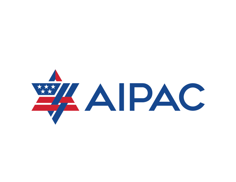
The process started with sketching and ideation. Our concepts ran the gamut from hyper-conservative tweaks to the existing logo, to some very high-concept ideas. Eventually we settled on a handle full of concepts. Through a very iterative and collaborative process with the client, we eventually narrowed it down to one concept. Then we worked diligently to make the concept as perfect as possible.
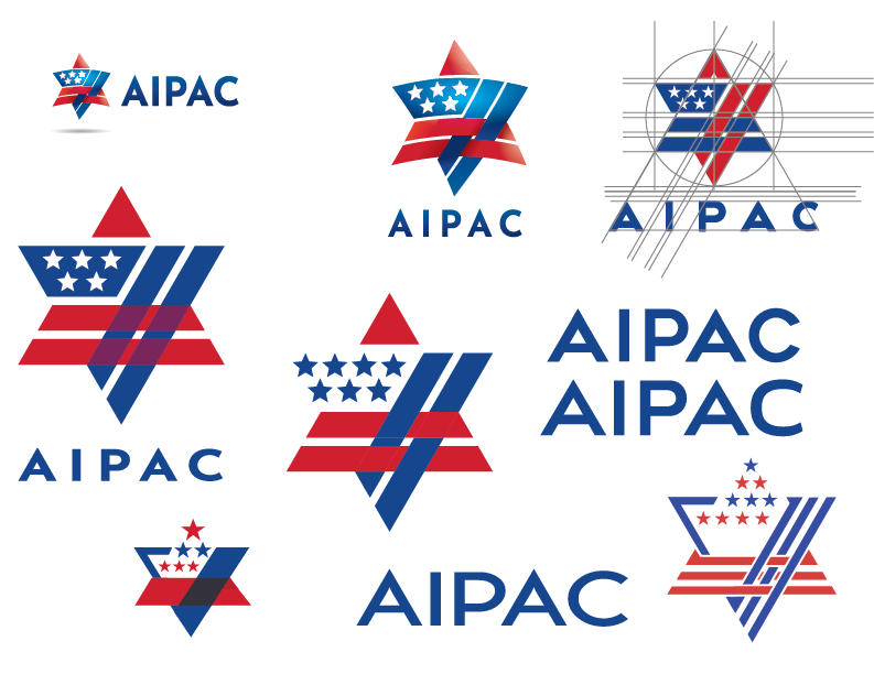
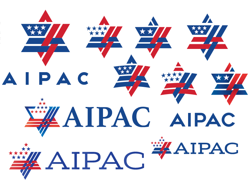
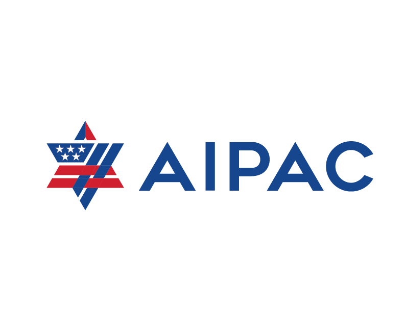
The Final Logo

We hit all our original criteria. The original feeling of the old logo was retained as well as the essential elements. It’s much more scalable, and its simplicity and classic design assure its timelessness. It also retains a feeling of strength while being approachable. Some other highlights:
The US flag influence is more predominate and obvious.
Everything (colors, spacing, etc.) is symmetrical and consistent.
The “A’ of AIPAC is a triangle, mimicking the shape in the mark, creating cohesion.
The text is custom.


